
Design That Bridges Old and New
I support brands and programs through the creative process of visual transformation—designing graphics, layouts, and digital materials that help communicate clearly and connect with their audiences. This page showcases the evolution of a visual system developed over time—guided by audience feedback, engagement data, and the goal of making information more accessible and aligned with institutional identity.
From Playful to Purposeful

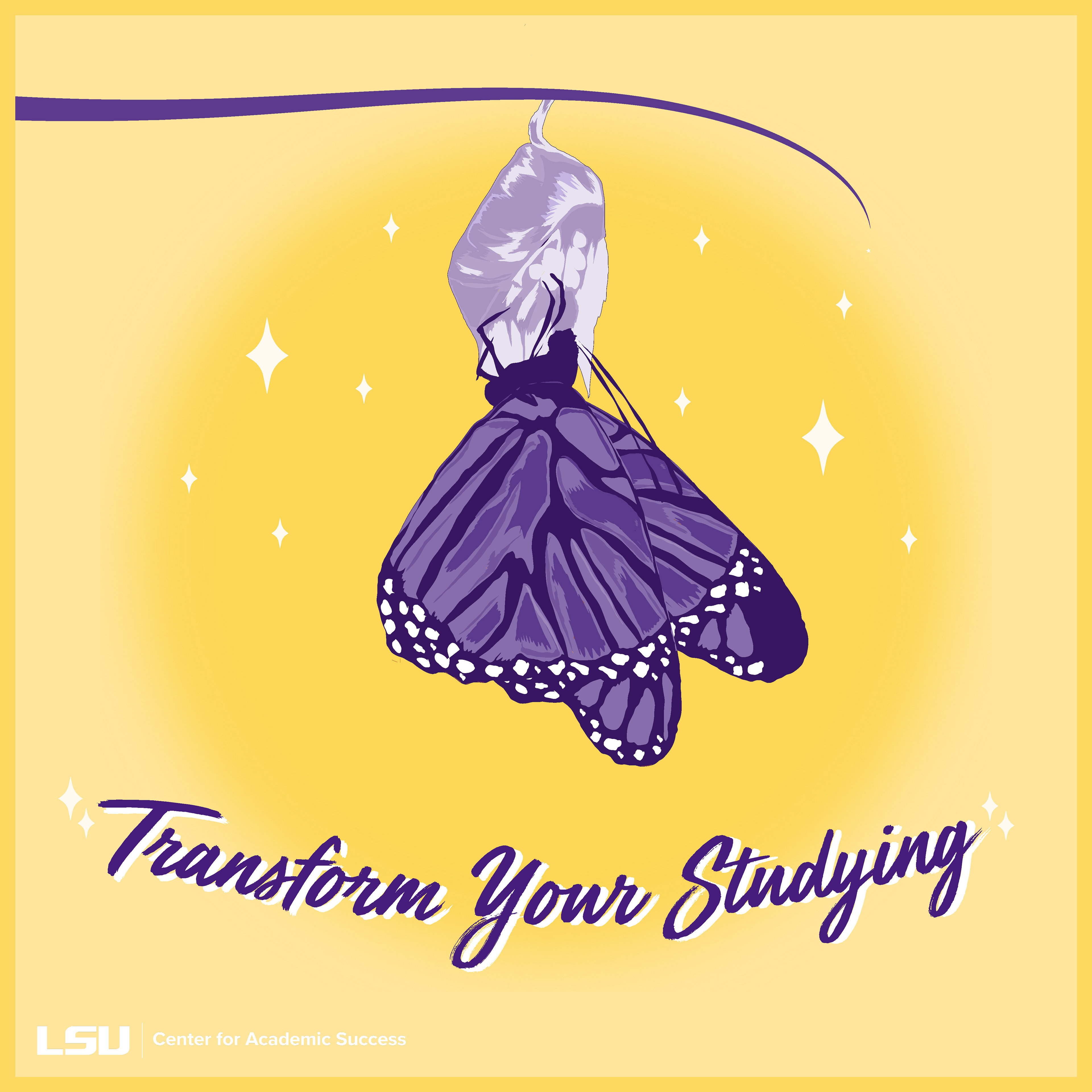
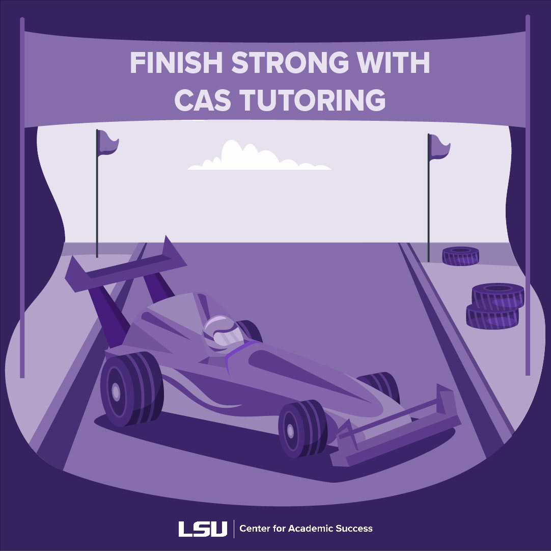

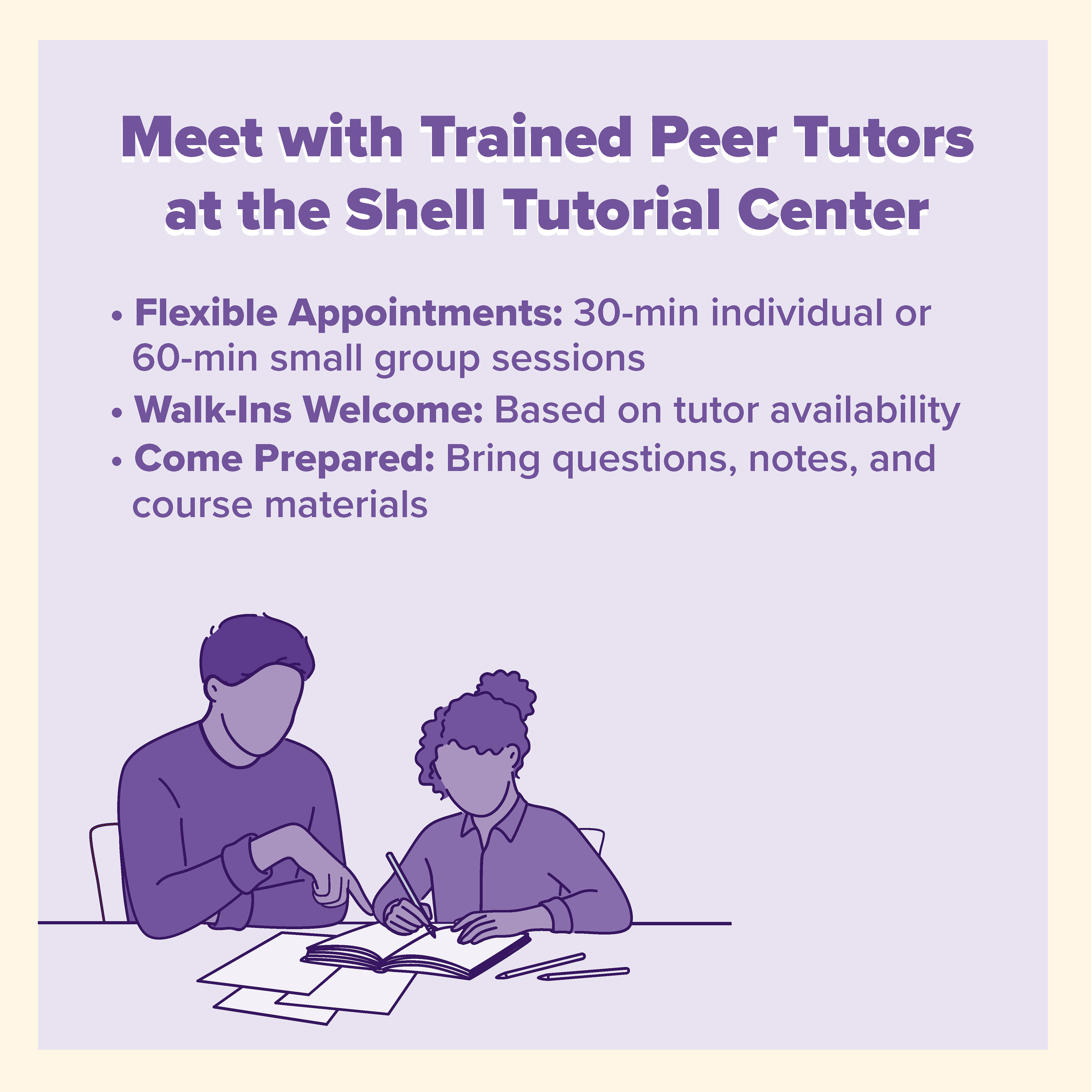
The initial phase emphasized visual energy and connection—bright imagery, layered compositions, and engaging social content designed to capture attention online. These posts reflected the personality of the program and invited interaction, particularly on Instagram, where imagery and tone were key to standing out in a student-focused feed.
Turning Insight into Clarity
When analytics showed that interaction didn’t necessarily translate to understanding, the design approach shifted.
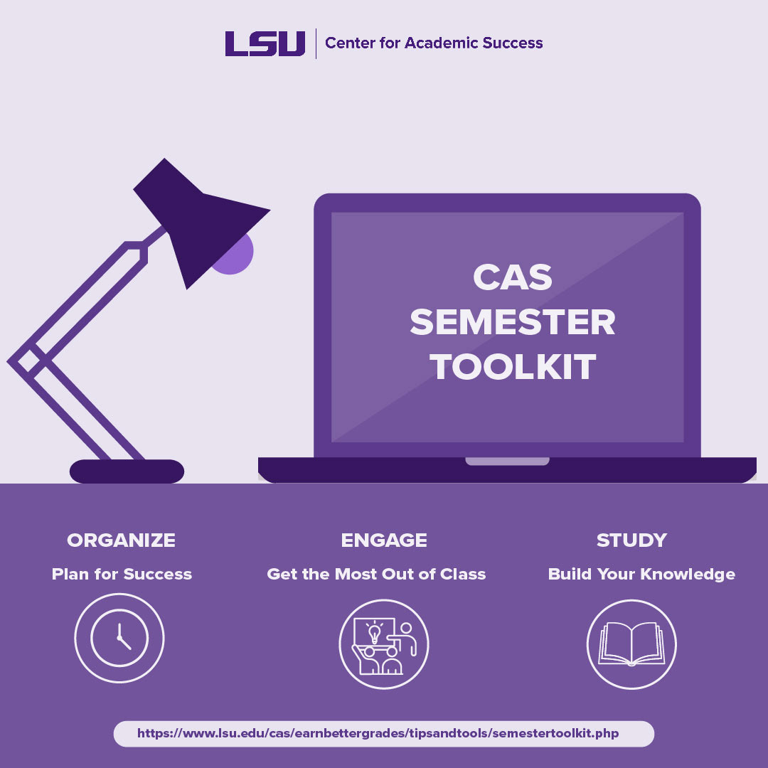
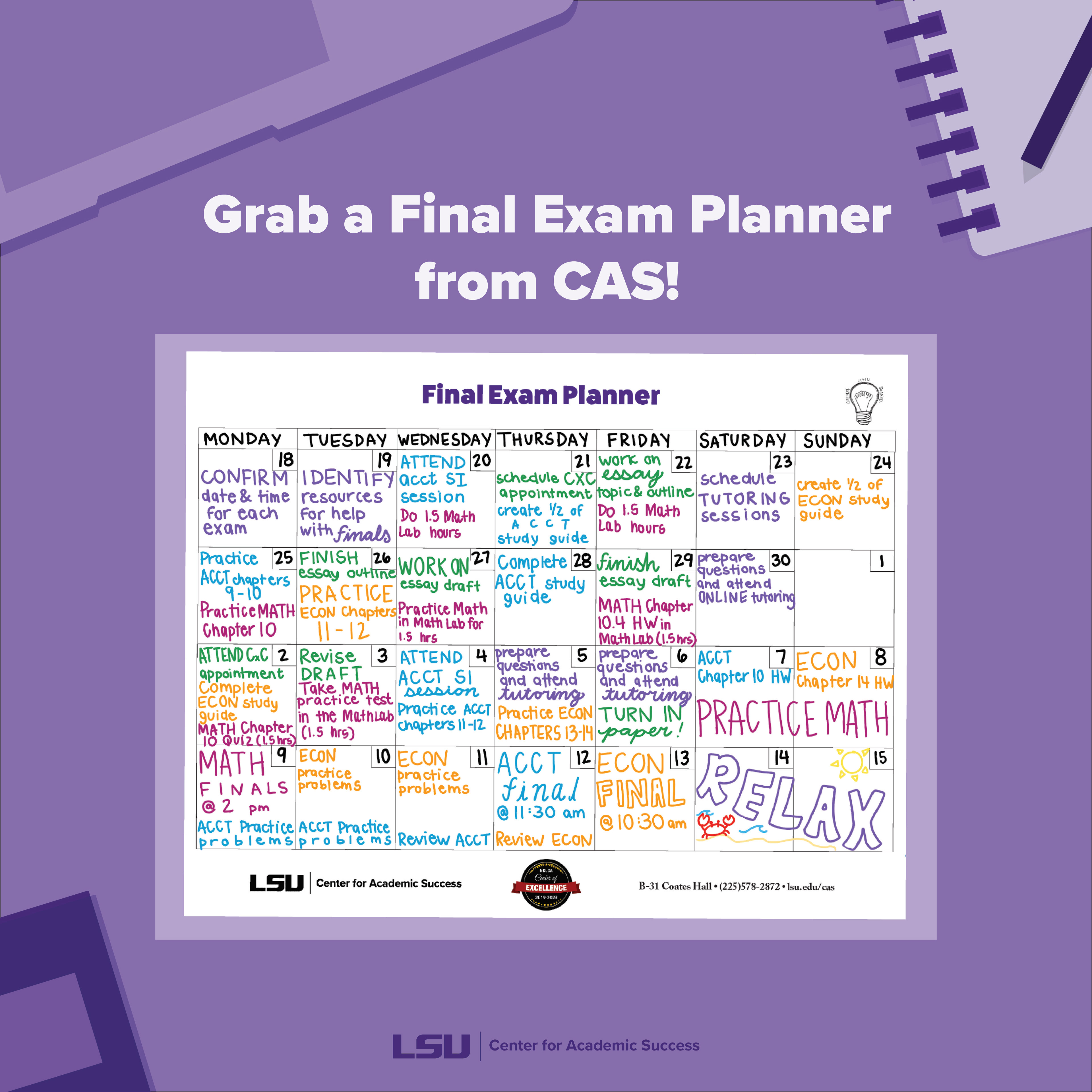
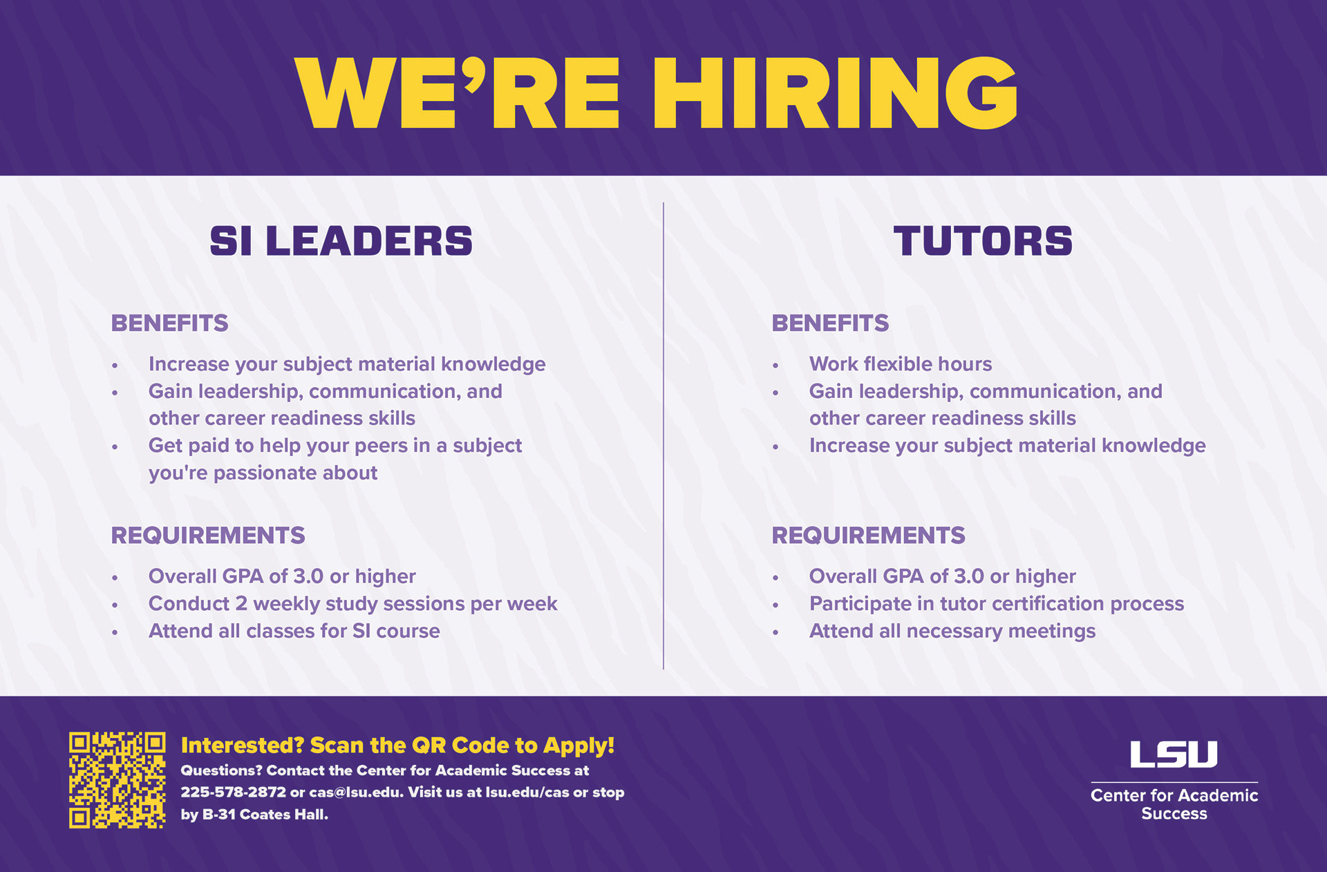
The next phase focused on guided, task-based graphics—step-by-step visuals that helped students complete specific actions within the program. This period emphasized clarity, hierarchy, and usability, ensuring each piece served as both a design element and a practical tool.
The next phase focused on guided, task-based graphics—step-by-step visuals that helped students complete specific actions within the program. This period emphasized clarity, hierarchy, and usability, ensuring each piece served as both a design element and a practical tool.
Designing for Alignment and Access
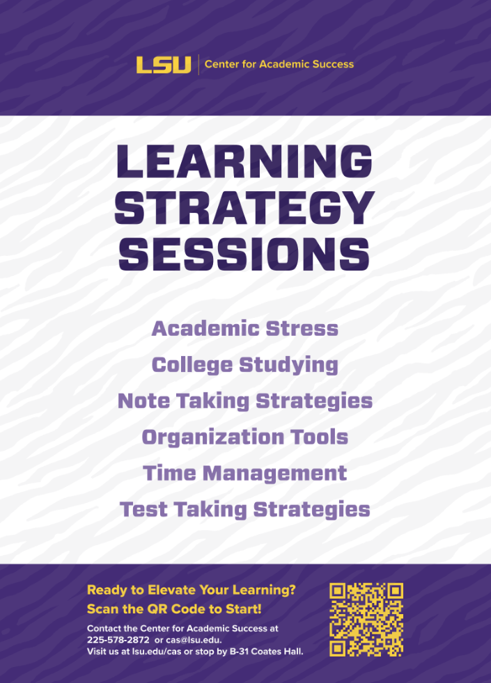
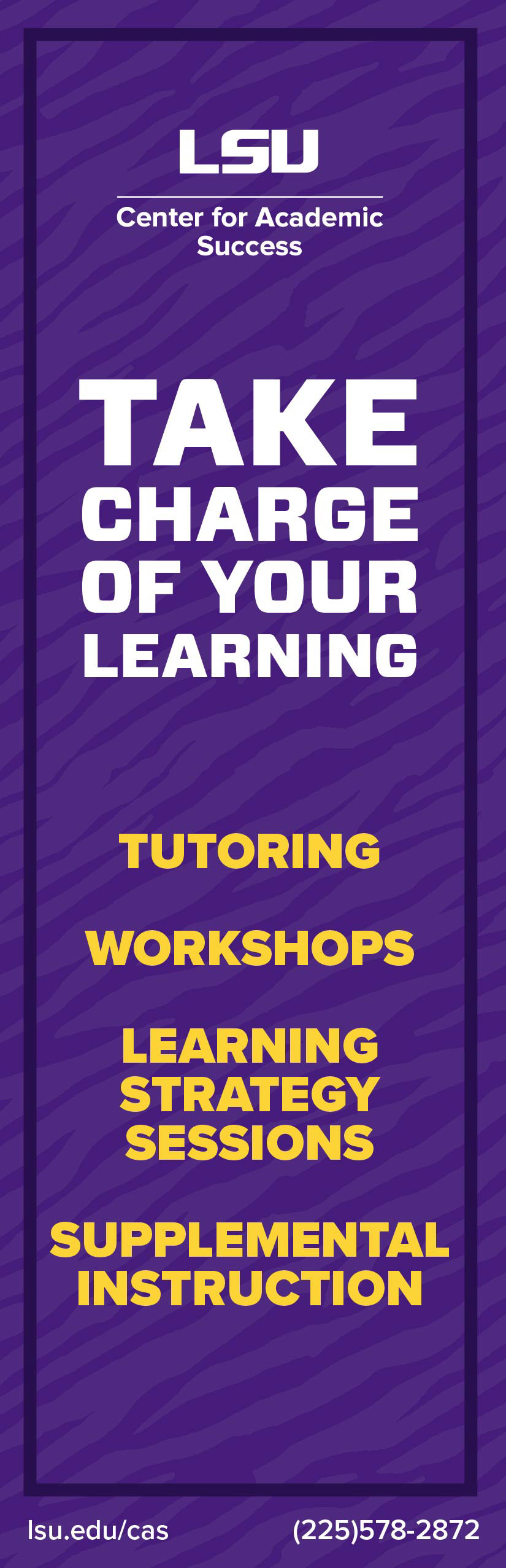
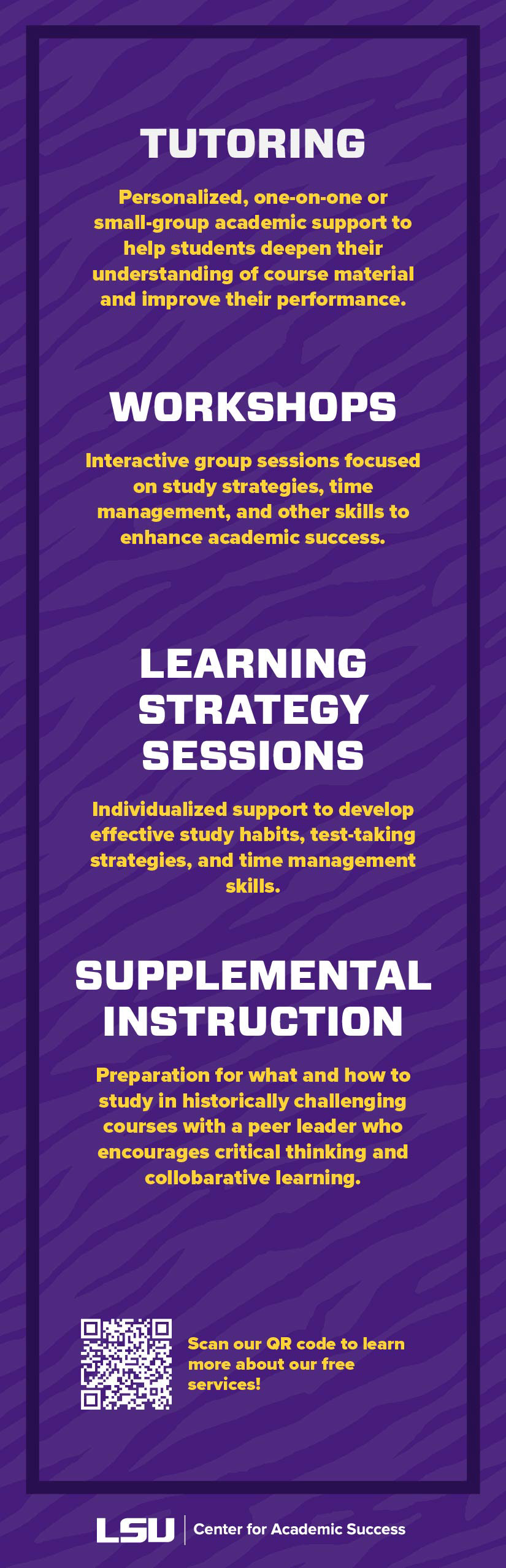
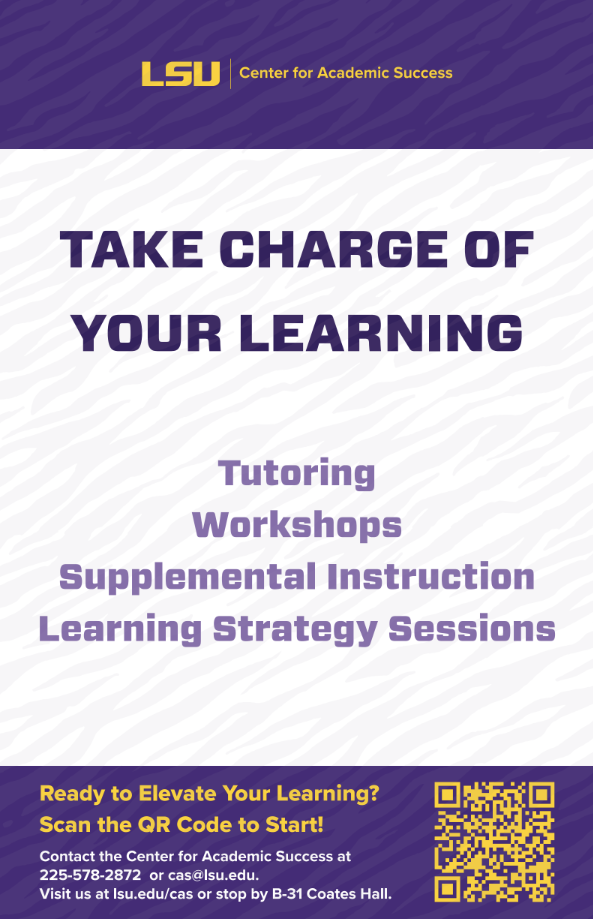
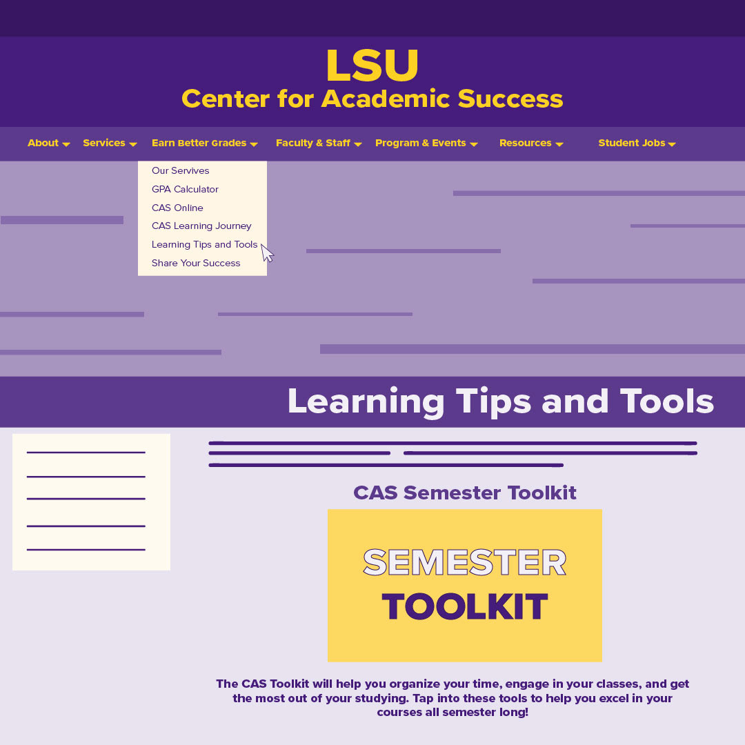
As the visual system matured, the focus moved toward a consistent, informational style that supported accessibility and institutional alignment. Typography, color, and structure became standardized to create a cohesive identity that felt professional, approachable, and easily navigable. This stage not only made information more accessible to students and faculty but also helped the program present a unified visual voice within the larger university brand.
Strength in Subtlety
This evolution reflects how design responds to audience needs—balancing creativity, clarity, and consistency. Each stage built on the last, transforming a playful social presence into a cohesive visual language that communicates effectively across platforms.